A rebranding is never simply an aesthetic decision. It is a move that responds to changes in the market, technology and consumer values. Between 2024 and 2026, three of the pillars of the IBEX 35 and benchmarks of the Spain Brand, Repsol, Mapfre and the former Cepsa (now Moeve) have undertaken rebranding processes that mark a before and after in their strategic visual communication. Why now? What do their new typefaces tell us? Why is colour no longer flat?
Moeve: how to ‘kill’ a giant to save the brand

The case of Moeve (formerly Cepsa) is undoubtedly the most radical. The rebranding process also includes a name change. This is the riskiest move in communication: giving up decades of brand recognition. Remember the case of HBO Max, which changed to MAX only to reverse the change a few months later.
Cepsa was founded as the Spanish Petroleum Company. In 2026, petroleum is a concept that is declining in terms of social reputation. The brand needed a conceptual clean-up. You cannot sell green hydrogen under a name that includes the word petroleum in its acronym.
Change in the colour palette: the traditional red and yellow have been abandoned. These colours are highly visible on the road, but are associated with fossil fuels. The new palette focuses on deep blues and turquoise greens. In colour psychology, this shifts the brand from the industrial sector to the technological and sustainable sector.
The naming and typography: Moeve plays with the word move (movement) and evolution. The typography is of style sans-serif, geometric, modern, with rounded terminations that suggest smoothness and efficiency.
Strategic implication: Moeve no longer competes with Repsol at petrol stations, competes with Tesla in chargers and with Iberdrola in energy for the home. Graphic design has been the bridge needed for the consumer to accept this new paper.
Repsol: farewell to flat design
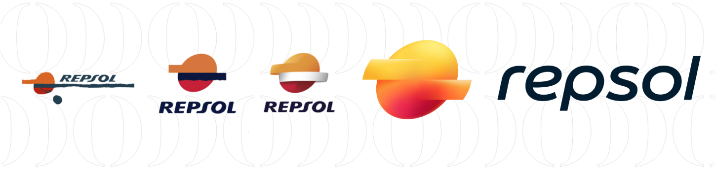
Repsol could not afford a complete breakaway like Cepsa’s. Its logo is one of Spain’s most valuable assets. Its strategy has been one of adaptive evolution.
Repsol’s previous logo was a design from the analogue era: solid, flat, static. The new Repsol logo seeks to represent a company that no longer just extracts energy, but also transforms and distributes it in multiple forms (solar, wind, electrical).
Gradient and 3D: as we said earlier, the popularity of mobile phones with high-performance processors and fast download speeds means that the resource optimisation championed by flat design is no longer necessary. Repsol is joining this trend by evolving towards a more realistic style, transforming its logo into a three-dimensional shape that relies heavily on the use of gradients. The transition from dark orange tones to this gradient, which starts with yellow and reminds us of the sun, creates a sense of luminescence. The logo seems to emit its own light, simulating a source of living energy.
The circular shape: the edges have been polished. The R of the typography and the central symbol now are integrated into a narrative of circular economy. Graphically, everything flows towards the centre, eliminating the sensation of heavy blockage. It represents the heat of the sun, the vibration of movement and the warmth of service to the customer.
Mapfre: the revolution of lowercase letters and mobile-first
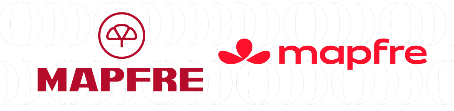
The case of Mapfre is a lesson in humanisation through typography. Historically, insurance companies communicated from a position of authority: capital letters, logos enclosed in shields or circles, dark colours…
Today, the relationship with Mapfre does not take place in a physical office with marble walls. It takes place in an app. The design of 2026 responds to the need to be an icon on the desktop of a smartphone, not a poster on a building.
From uppercase to lowercase: this is the most powerful change. By writing Mapfre in lowercase, the brand renounces imposing itself in favour of conversation. Lowercase letters are perceived as more friendly, modern and digital (think of logos such as Amazon or Airbnb).
The clover without borders: the circle surrounding the iconic shamrock has been removed. In graphic design, a circle is a border. By removing it, the symbol breathes. The aim is to create a more open, transparent and collaborative brand. The tone has been adjusted to a more vibrant red, less blood-like, optimised for screens. It is a red that conveys vitality and active protection, not relief after an accident.
Implications: What does this tell us about the current market?
When we analyse these three cases together, we see patterns that are worth highlighting:
· The dictatorship of the pixel over the paper. In the past, logos were designed to look good on paper. Today, they are designed to be a 16×16 pixel favicon or an Instagram avatar. Mapfre’s simplification and Repsol’s brightness are designed to shine in digital environments.
· The end of corporate authority. Brands no longer want to command respect through their size. They want to be partners. The use of rounded shapes, lowercase letters and softer colour palettes responds to a consumer psychology where users value empathy over hierarchy.
· Sustainability as a primary colour. It is no longer an addition to the annual report; sustainability is the visual focus. Moeve uses green, Repsol uses light and Mapfre uses openness. Graphically, the brands are eliminating visual noise to project cleanliness and efficiency.
Conclusion: design as a business driver
The changes at Mapfre, Repsol and Moeve show us that design is the visible face of business strategy. If a company changes its revenue model (from oil to renewable energy, or from insurance policies to digital services), its image must change for the market to believe it. These are not just logos. They are the insignia of a new economic era in which Spain seeks to lead the energy and digital transition. No one disputes the importance of strategic design anymore. Designing is deciding. And these three brands have decided that the future is lighter, brighter and, above all, more human.